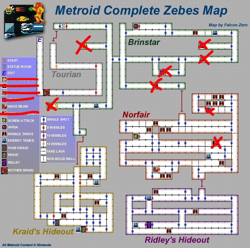
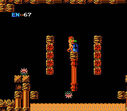
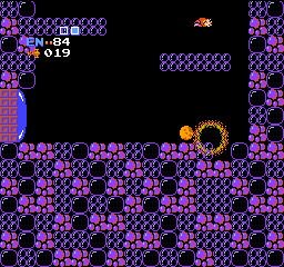
 I started Metroid as my prior post indicated I would do. I consider myself a fairly masochistic gamer (I have all 10 Mega Mans under my belt without any cheat or help), but I never was a map maker. The furthest I have gone is Etrian Odyssey with the ability to “auto-map”. There is one concession I made with Metroid. I wanted a map. The one you see above is the map I have been using and marking off as I progress. I have not used any other guides or walk-throughs.
Metroid nails some things off the bat. The atmosphere is spot on. It feels desolate and alien and the sparse use of music and effects adds to the tone of the game. The learning curve in the game can be very daunting. This can be viewed in one of two ways, rewarding or overly-complicated. My take is that it’s learning curve discourages new player, to the point where they stop playing. Hell, I’ve started Metroid three or four times prior and never stuck with it. It drops you in without so much as ‘hello’. I would give subtle hints to get the player invested. These are fairly moot points in terms of the Metroid francise because they adress this concern in Super Metroid. That being said, this is for my benefit, not Nintendo’s.
In general I don’t care much about graphics in a game. The gameplay mechanics and motivation are far more important, but I should at least comment on the visual style. Despite many modern games with their muddied brown-grey-brown palette, Metroid uses high-contrast and stark blackness to create a very compelling color scheme.


Each area of the game has a color scheme that makes it feel distinct and packs a punch. Games shouldn’t be afraid of color.
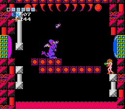
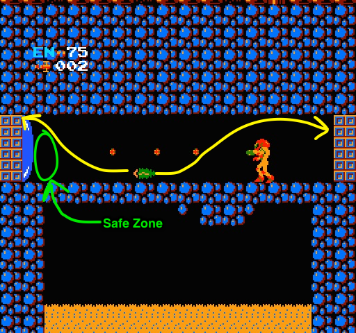
One of the surprising things I encountered in the game is the run-and-gun strategy ala Mega Man just doesn’t work. The enemy placement and behavior has been thought through and punishes this action. For instance, there is this enemy called a Waver. It’s action is basically to move in a sine wave pattern and change direction when it bounces off things. They take a lot of hits, but their patterns are predictable so it’s best to avoid them all together if possible.
Here is when I first noticed:
 When you first enter the door on the left you will see the enemy come towards you. Your initial instinct is to run at it guns blazing. The best strategy however is to stay put and let it get to the maximum height of its arc and then run under it. You can outrun it and avoid the encounter all together. This ladies and germs is smart enemy placement. They most likely figured that out by play testing and seeing people’s behavior. Play testing is imperative. I love that the game makes you think about what your doing instead of mindlessly running around. It becomes an immersive experience instead of a passive one. The games that I tend to enjoy.
That will finish up the first update. I still have more to play and more notes to take. This first session has been super helpful and I hope to continue this. More to come!
